Korea International Art Fair 2018 by Studio fnt
Opinion by Richard Baird Posted 10 October 2018

Each year KIAF plays host to and brings to the Korea domestic market the artworks of international artists and galleries. This year, the 17th Korea International Art Fair took place between the 4–7 October in the city of Seoul.
With a desire to become the pre-eminent art platform of South Korea, serve as a conduit between the Asian and international art scene, and function as a tool in which to introduce vibrant new Korean art to a global audience of curators and collectors KIAF seeks out, collates and presents the groundbreaking and thought-provoking.
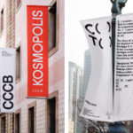
Studio fnt worked with KIAF to develop a new visual identity for the fair. With such a wide variety of works on display; those of different origins, techniques, physicalities and modes of expression, the confluence of spot colour, proportionality and abundance serve as a unifying visual language that links posters, catalogues, tickets, banners and tote bags.

The visual language is clear, the varying proportionalities of the art canvas, the blank surface, serve as the unifying motif for a diverse exhibition of international works. It recognises and brings into sharp focus that universal beginning of all work; the empty surface before a painting, a sketchbook that waits for the lines of a sculpture or the manifestation of an idea through words.
The blank canvas serves as a surface on which to project onto. It represents a tension between thought and action, a moment of anticipation and a gesture of potential and opportunity. Further, knocked out of colour, the surface of the blank canvas becomes a portal into the universal experience of the white cube, the ubiquitous gallery space, an experience that transcends international borders.


The proportionality of the “canvases”, their variety, stacking and abundance deliver a strong immediate impression, one of diversity and the notion of being filled to the brim. In this sense, the spatial emerges, a critical component of the gallery experience and the utility and compartmentalised structure (and the spatial-economy of booth-space) that codifies the fair. This sense of structure is developed through the use of print technique and colour, the use of material and implied transparency, the building up and layering of content. The approach walks a pleasant line between an aesthetic joy and a layered communicative potential, a systematic usefulness and the suggestion of the individual voices of featured gallery and the artists they represent.
There is an intrinsic jostling for prominence in size, proportionality and arrangement. While the fair collates and curates, this is less about a collective dialogue but individual provocations and worldviews seeking to be heard and considered. The fair attempts to mediate this, and Studio fnt wrestle it into a singular concept, to capture the spirit of the international showcase.

The canvas serves as a useful surface in which to hold information. The chaotic is brought into order through a simple top-down hierarchical approach and given clarity of meaning in the presentation of featured artworks and floorplans within printed documents. Colour, much like form, bridges aesthetic pleasure and communicative necessity, calling out different pieces of communication.
Other highlights include the simplification of graphic gesture in tune with the singular communicative intentions of each material object. The VIP card, Collector’s Pass, the Opening Ceremony and Catalogue Exchange documents, through a graphic simplicity, express a singular focus, where those that are broader in their content such as an overview of the fair, or larger in their format, are more complex and busy. This complexity to format ratio is a thoughtful detail throughout and offers a variety where it could have been repetitive.


The initial impression is one of a strong graphic language. Yet, the concept also makes its way into the material and the interactive by way of perforations, transparent perspex and the proportionality of different printed pieces. As such, there is a total vision here in which the format and various surfaces, structures and mechanisms of communication become a critical part of the concept, not just surfaces to receive the graphic.


Solid blocks of colour adjacent to white pages really emphasise the printed page as a canvas, and ties in neatly with graphic identity, serving as a tool to break up content. Further, the arrangement of type (see above) creates moments of framed space, mirrors the stacking of canvases and gives a motion to the work. Photography of specific artworks function as a key to the visual language, bringing a material reality to some of the more unusual proportions of the canvases and tying these to the sculptural component of the fair.


The blank canvas provides, just like art, the opportunity for multiple readings. For some, it immediately speaks of the artboard, and the challenge and opportunity it presents. Others may see the more meta; various portals through which to travel through and experience the works of international artists and galleries, just as the space of the fair manifests this within one hall and the booth as gallery. As a practical piece of visual identity design it catches the eye, is distinctive, has range and flexibility in its application; graphically, materially and interactively, and serves as a useful tool in which to structure simple and more detailed information. More work by Studio fnt on BP&O.
Design: Studio fnt. Opinion: Richard Baird.